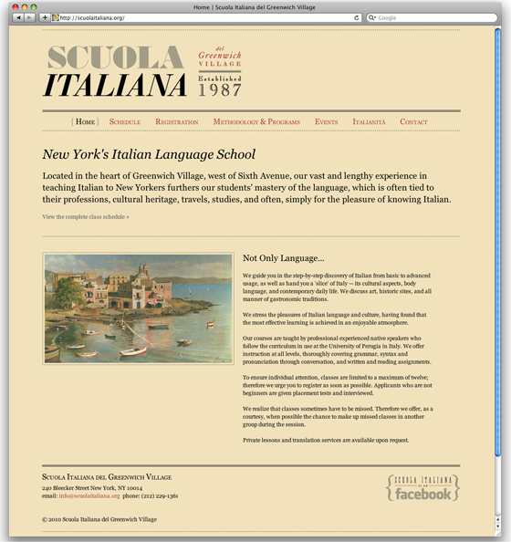
We’ve just completed a redesign of ScuolaItaliana.org, a brochure website for Scuola Italiana del Greenwich Village. The site offers schedules and registration forms, detailed information about the school’s methodology, events and additional resources for potential and returning students. Our goal in the redesign was to refresh the school identity and to improve the overall site navigation and content organization.
Scuola Italiana was founded in 1987 and over the past 23 years thousands of students have learned Italy’s language and a deeper understanding of its remarkable culture. We wanted to create a logotype that would not only reference Italian design (yes, we used Bodoni) but that would also reflect the establishment of the scuola.

We re-purposed the majority of the content including a wonderful library of images the scuola has collected for event announcements over the years. We also based the color palette on the original website so the overall site design would be familiar to returning students. We’re quite proud of the outcome, a minimal html design that shows how pretty code can be.

Heather is a student at the scuola and Bad Feather loves Italia! We thoroughly enjoyed our research for this project. Here is a great article we stumbled across on Italian type design including a story about Massimo Vignelli smuggling Helvetica.